/ Vinte anos de projetos

O trabalho é a prova.

Campanhas físicas e digitais concebidas sob a mesma linguagem tipográfica. Cada projeto aqui foi entregue — em parede, tela ou projeção.
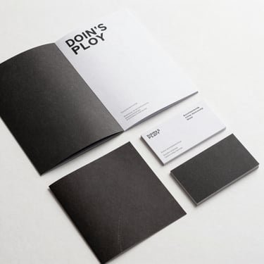
Grade de projetos

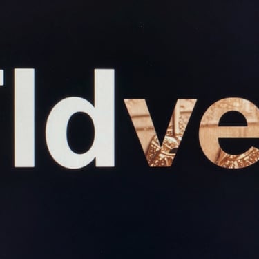
Mídia física. Mídia digital. Um método.

Split-frame documentation of a single campaign: left half shows the printed poster installed on a street wall in daylight, right half shows the same typographic system live on a desktop monitor — both captured in one wide photograph, natural light on the left, screen glow on the right, no people, sharp focus on the design across both surfaces
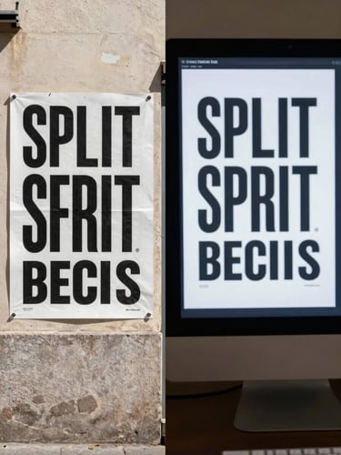
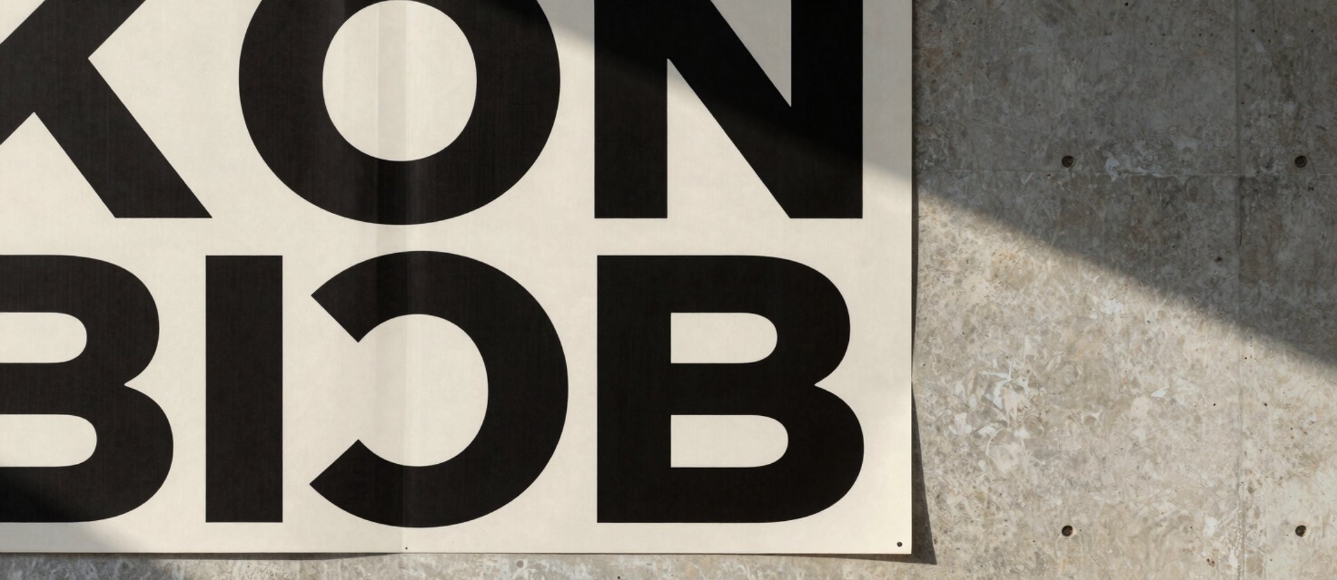
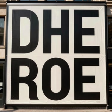
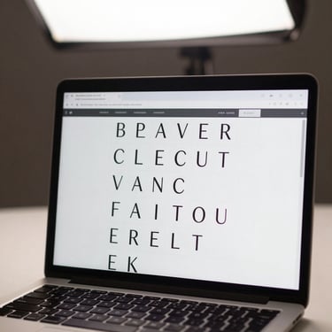
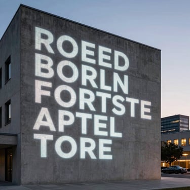
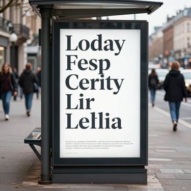
— Uma campanha, dois suportes

Mesma tipografia. Parede e tela.

Quando o sistema tipográfico é construído para funcionar nos dois meios, o resultado é uma campanha que se reconhece em qualquer formato — sem adaptação, sem perda de rigor.

Projeção, impressão e interface tratados como um único problema de design. Essa é a estrutura que sustenta vinte anos de entrega.

Um projeto sólido começa com uma conversa direta.

▸ Próximo passo